Posts

Nonwestern Art- China

Image
 Nonwestern Blog- Early Qing Dynasty China     China has a long history and centuries worth of art. I decided to focus on the traditional ink art paintings from the early Qing Dynasty. Wooded Mountains at Dusk , Kuncan, 1666, China     The Wooded Mountains at Dusk  is a beautiful work painted by the Buddhist artist Kuncan. Kuncan was a friend of poet-artists, and after visiting Yellow Mountain in southern Anhui Province he was inspired to paint and followed his friends' methods ( Wooded Mountains at Dusk ). The detailed use of lines, forming the landscape, and void space, appearing as a stream and mist, create foggy wooded mountains that offer a feeling of mystery and intrigue. This, combined with the poem ( translation ), gives a feeling of being present while giving you something to contemplate while enjoying the work. Viewing a waterfall from a mountain pavilion , Li Yin, 1700, Yangzhou, China          Another Stunning work is  Viewing a waterfall from a mountain pavilion. This

Mid-Modern Art - Vietnam War

Image
 Mid-Modern Art - Vietnam War     The Vietnam War, starting in 1955 and lasting for twenty years, was a highly impactful war that affected the  United States. The development of technology allowed the news about the battlefield, good or bad, to be more readily available to the public. This more public view of the war inspired many works of art. Swamp Patrol – Roger Blum, 1966         Swam Patrol  was an interesting piece of art made during the Vietnam Combat Art program depicting a unit patrolling the swamps. Something I like about the work is the use of cool and dark colors gives a feeling of tension to the work, especially considering that there was a real worry of booby traps. This tension is heightened by the feeling of insecurity with the use of thick and faded lines for the background trees, due to the lack of knowledge of what they hide.  Finally, placing the soldiers farther back in the work is also a good use of spacing to show how the unit patrolled in a swampy environment. 

Influence of World War One on Early Modern Art

Image
 Influence of World War One on Early Modern Art           The first modern war, World War One, left impacts on those from all walks of life, whether it be those left at home and in the factories worrying about their loved ones, or the millions who fight and die on the battlefield. The catastrophic mixture of premodern tactics and modern influenced many things such as weapons, tactics, vehicles, medicine, and most importantly for us, art.   The La Mitrailleuse’  by CRW Nevinson, London, 1915     The  La Mitrailleuse’  is a work that I found interesting and shows how the war shifted the view of people on soldiers. The blues and greys accompanied by the angular features and shadowed eyes, show how "they appear almost like machines themselves, losing their individuality, even their humanity, as they seem to fuse with the machine gun which gives this painting its title"  ( 'La mitrailleuse', Christopher Richard Wynne Nevinson, 1915 ). This rings especially true due to the

Classical blog exhibit - Revolution and art

Image
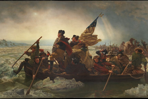
Classical blog exhibit - Revolution and art     A theme I found interesting for the classical era is the Revolutions, more specifically the American Revolution. While searching through various works, I found paintings that I wouldn't mind owning. These artworks of the revolution have mainly tied into classical art with the use of themes such as patriotism and heroes, along with the strong use of lines and accurate details.    Washington Crossing the Delaware      The first piece of classical art I enjoyed is Washington Crossing the Delaware , painted by Emanuel Leutze in 1851 while in Dusseldorf, Germany. The use of art elements such as the lighting, colors, and lines highlight patriotism and George Washington while creating an enjoyable painting.      The first notable element is the lighting. The lighting is primarily used to draw attention to George  Washington and the American flag. This focus allows for an emphasis on who in the painting was the portrayed hero and the symbol o

Baroque: The Syndics of the Clothmakers Guild, 1662

Image
Aesthetic Appreciation with Analysis      A painting from the baroque era that I enjoy is  The Syndics of the Clothmakers Guild , painted by Rembrandt in 1662 while he was in Rozengracht, Amsterdam, portraying the Staalmeesters in a meeting. The elements that make it enjoyable are the use of colors, lines, and spacing. The use of color sets the tone for the artwork. The warmer colors of the reds and browns set a calm and relaxed atmosphere. This creates a feeling that everything is progressing smoothly for the Staalmeesters in the meeting, along with them being relaxed and friendly with each other. The black and white meanwhile creates a more serious tone. this tone shows that even if they are relaxed, they are focused on ensuring the quality of the textiles they're checking. The black also emphasizes the Staalmeesters while highlighting their accounting book, which holds the verdicts on what textile cloths will pass or fail, creating a feeling of importance for the meeting.     Th

Renaissance: Cosimo de Medici in Armour

Image
      A piece of art from the renaissance that I liked was   Cosimo I de’ Medici in armour,  a portrait painted by Agnolo Bronzino. This art was painted in Florence in 1545, eight years after Cosimo I de' Medici became a duke.     An art element that enhances the painting is the tone. The light tones highlight  Cosimo I de' Medici's face, making it the primary focus of the art piece. It also, to a lesser extent, highlights his ornate armor. This displays his power and wealth, which come from his strong political influence and his ownership of the Medici bank.     Another element would be the use of color. The darker colors, such as blue and black, create a calm feeling when looking at the art. This also makes  Cosimo I de' Medici appear as a calm and dignified person, due to the atmosphere created by the dark colors. The light usage of red also once again draws attention to his armor.     The use of texture makes the painting feel more lifelike. The smooth texture, alon

Art Analysis of van Gogh, Vincent. Irises 1889

Image
   I enjoyed the artwork Irises,  created by Vincent van Gogh in 1889 as a study after willingly entering an asylum in Saint-Rémy, France, and after staying a few weeks he found inspiration in the overgrown garden. Some of the artistic elements that helped me enjoy the artwork were texture, contrast, and space in the painting.     The use of texture allows the parts of the painting to feel more like the actual items. An example would be the soil used red, short, and thick lines to make it seem soft and fertile. You can also see that the leaves are smoother to better match their feeling, and the flowers have rougher directional strokes to create a sense of volume.      The use of contrast made the overall painting stick out more. He used color contrast to have the reds and greens  of the soil and leaves enhance each other and make them stand out. There is a similar contrast between the blue-violet irises and the orange-yellow background.     The use of space ties everything together and